I’ll be putting together some visual charts that ‘help’ get around the direct subtle and simulation management because the ‘conceptual’ management strategies just react to what is directly ”visible’ to you. So, at least initially the subtle and simulation management only reacts to the visible titles.
This page gives an example ‘visual’ with instructions on how to approach reading these.
I’ve no idea how a ‘visuals’ page will appear on a phone screen – likely not well.
To give the visual pages as much room as possible the right sidebar will disappear so the page uses the full width. To recover the right hand sidebar menu simply click on any menu element above the page EXCEPT a ‘visuals’ page. Once you’ve got the idea how these work then check out the finished VUE’s that are linked below this VUE chart.
Central Introduction
-
And then this...
Images can be presented

-
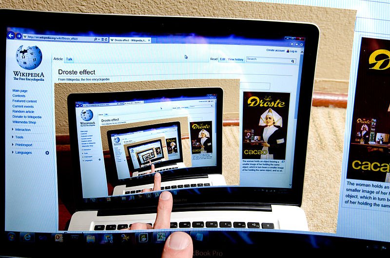
Recursive Image
-
Image explained in detail.
Another Main Title
-
Another Sub-Discussion or Explanation Element
Title of Main Topic
-
First Possibility
-
Second Possibility
-
-
First Possibility
-
1 Possibility
-
2 Possibility
-
-
-
Second Possibility


What you are reading now is a POPUP of informaiton which is embedded (some would say 'hidden') within the display element called 'Central Introduction'
This entire page gives an example of a VUE diagram chart.
VUE stands for 'Visual Understanding Environment'
It allows interconnected information to be presented very well while allowing embedded (hidden) text explanations to be popped up to present great details as needed rather than you being overloaded with a huge amount of information filling all corners of the screen.
Basically VUE allows you to present information held within visual elements.
The SERIOUSLY important thing from our point of view is that the vast majority of the detailed 'worrying to the simulation' descriptive information is actually hidden from view then the'Earth Sim Information Management' software.
Because the simulation only responds to what is visually present then because these VUE presentations initially only present titles they don't actually activate as much of the usual thinking management shit you'd get having all of these explanations in the same detail on the same web page.
NEXT read the "And then THIS" sub element here by moving your mouse over that sub elements pen icon...
This is s sub element usually it would go into more detail or sub detail of what the parent or OUTER display element is focused on explaining...
I'd go anti clockwise around this VUE chart!!!
Follow the 'boring, straight black line'
Read the 'Images Explained in Detail' sub element...
You will notice the |.jpg | above the pen icon you are hovering over to read this? This indicates that there is a .jpg image associated with this display element.
You can click it to open a larger image. Just click the image again to close it.
Check out the text in the 'Image Explained in detail' purple display element below the image.
You can attach an image to a display element.
Clicking on the image above will have you presented with a full size version of the image. If you want to see the full image of any picture presented in any element then click on it. Just click the image again to close it.
Above the pen icon you hovered over to read this you will see | web | if you hover over the web word you'll get the URL and if you click on the 'web' word then the web page of that URL should open in your browser. On this web page the link within this page titled 'Mirror in mirror effect' if clicked leads to a page with the image displayed above.
So, anywhere you see | web | in the left side column there will likely be a web URL link leading to something relevant.
Keep going...
Blah, blah...
This is the first level of explanation angle 1 from a Green thinking line
This is the first level of explanation angle 2 from a Green thinking line
This is the first level of explanation angle 1 from a Yellow thinking line
This is the first angle of an Orange explanation within a Yellow thinking line
This is the second angle of an Orange explanation within a Yellow thinking line
This is the first level of explanation angle 2 from a Yellow thinking line
The connecting lines connect related topics and highlight the relationships between the display elements you are presenting.
This is a boring 'straight' connecting line. You can also have an 'arc' single curve line and a double curvey line to weave past other elements.
Now mouse over the pen icon that's part of the pink triangle...
A dotted green single curved line without a title BUT it does have annoying text describing just itself...
A very thick single curved line without a title. BUT it does have arrows at both ends!!!
This line temporarily disppears behind a display element. All separate elements and connectors can be moved behind or to the front of all others..
Connecting lines can not only be labelled they can hold text too. If a connector has a pen 'icon' then it will have some explaining text associated with it.
Next, mosey on over to the image element on the left and do some 'mouse' hovering...